
Anna approached me with an exciting opportunity to create a brand identity for her very own company, Stellar. As a craft syrup company, Stellar is the pinnacle of Anna's passion for the art of cocktail and coffee-making.
What makes Stellar truly unique is Anna's commitment to crafting small batches of high-quality, organic syrups using locally sourced ingredients. With a focus on strong flavor ratios and a promise to never using enhancers or preservatives, Stellar's syrups are a testament to Anna's continued dedication to excellence.
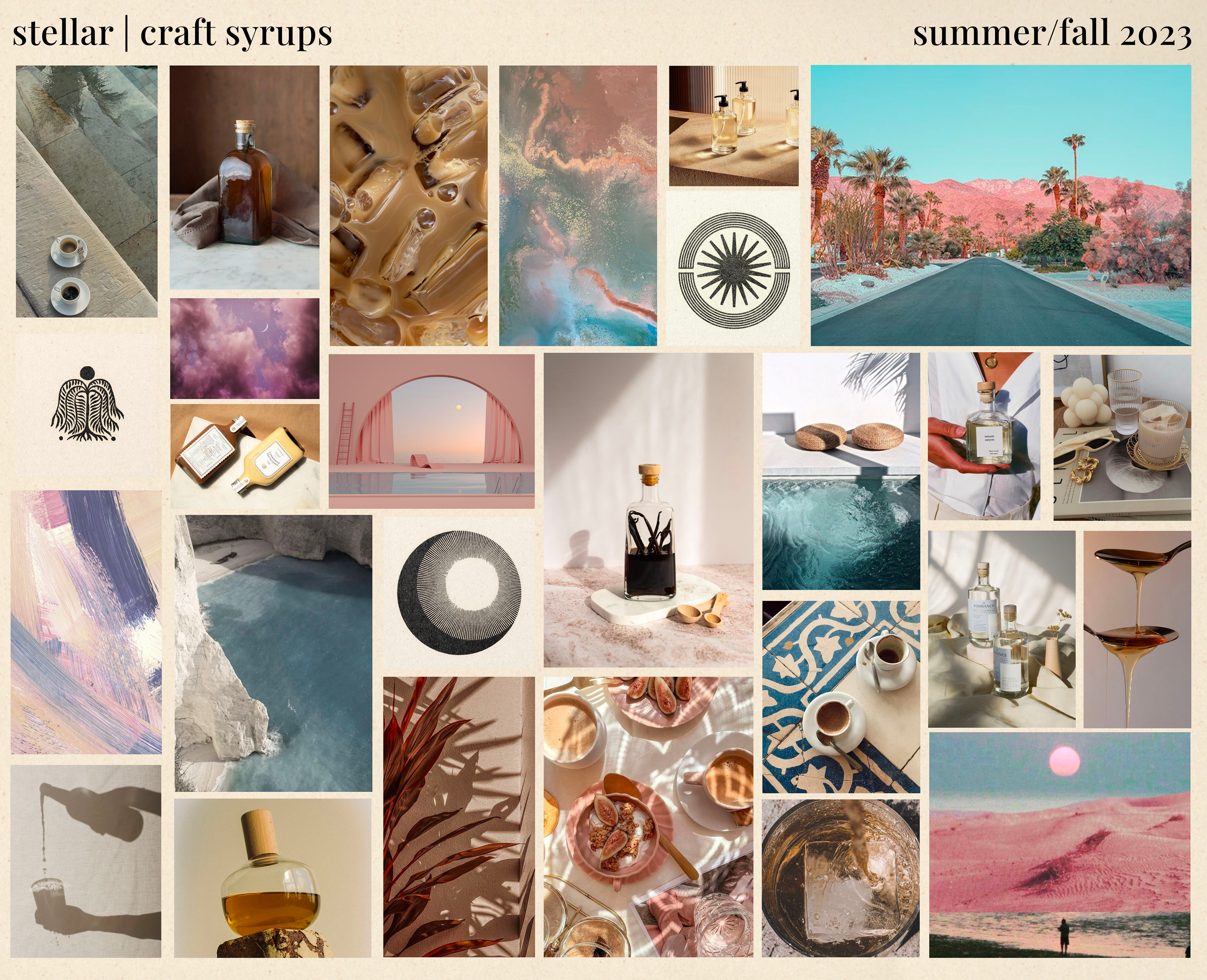
I was thrilled to collaborate with Anna and help her bring her vision to life by creating a brand identity that perfectly embodies Stellar's essence. When Anna expressed her desire for an eclectic and California cool aesthetic with exuding an elevated and groovy style, I knew I had to start with a comprehensive mood board.
To capture the perfect vibe for Stellar, I drew inspiration from a range of sources, including wabi sabi, the luxurious estates nestled deep within Topanga Canyon, and a glamorous yet understated take on neo-rococo (is that even possible?). I also explored art prints that emulate the playful and vibrant style of 70s block prints, reminiscent of "real fun, wow!"
As a consumer in Anna's target demographic, I also considered what I would want to see from a syrup brand, ensuring that the mood board captured every possible idea that could contribute to the ultimate brand identity for Stellar.
Once I received Anna's excited approval, I started doing research into what other brands were doing. I presented a few options, and having seen what Anna liked, I began brainstorming amalgamations of branding that has worked alongside visuals and symbols Anna was drawn to for her project. The following were what I came up with:
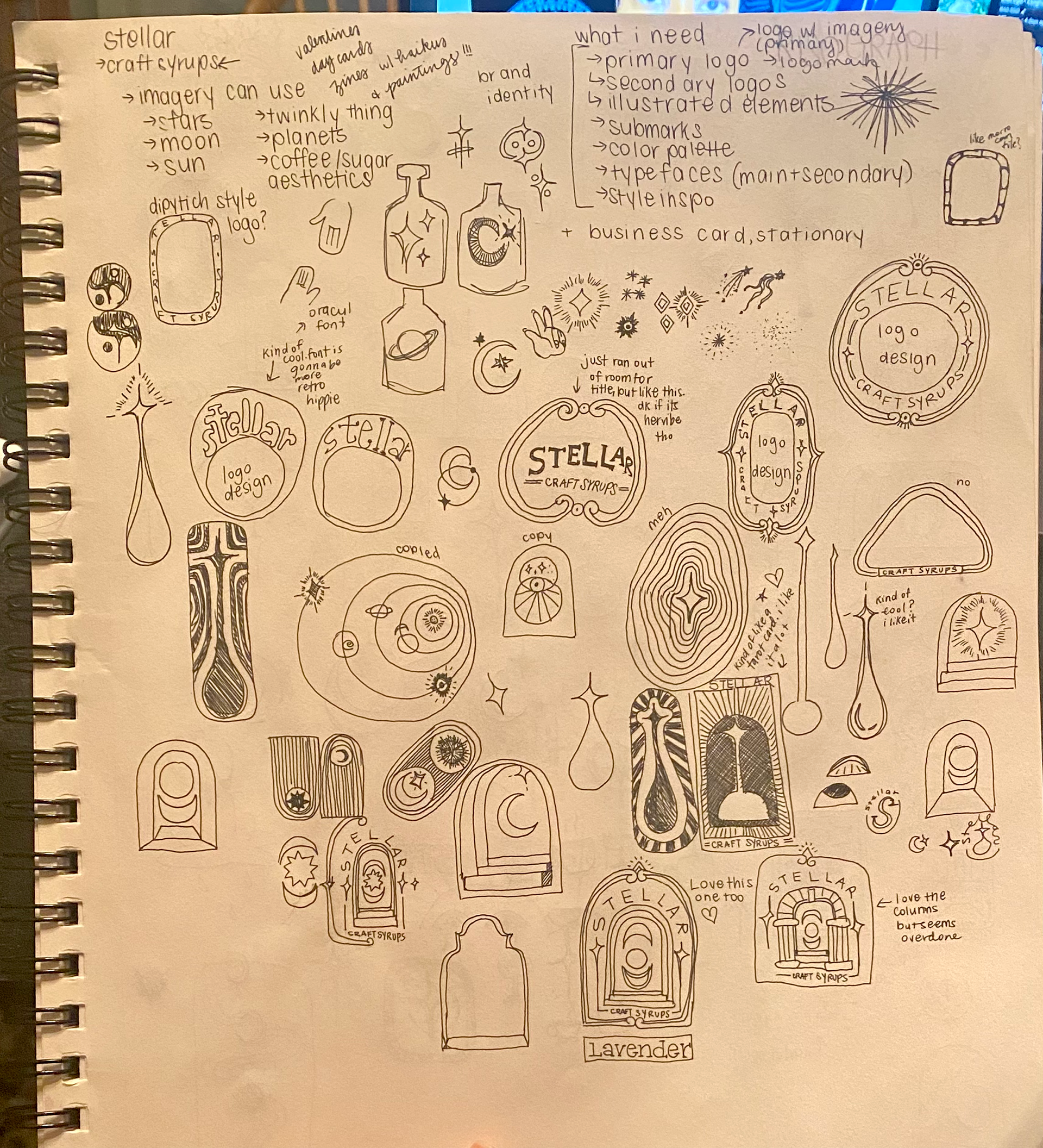

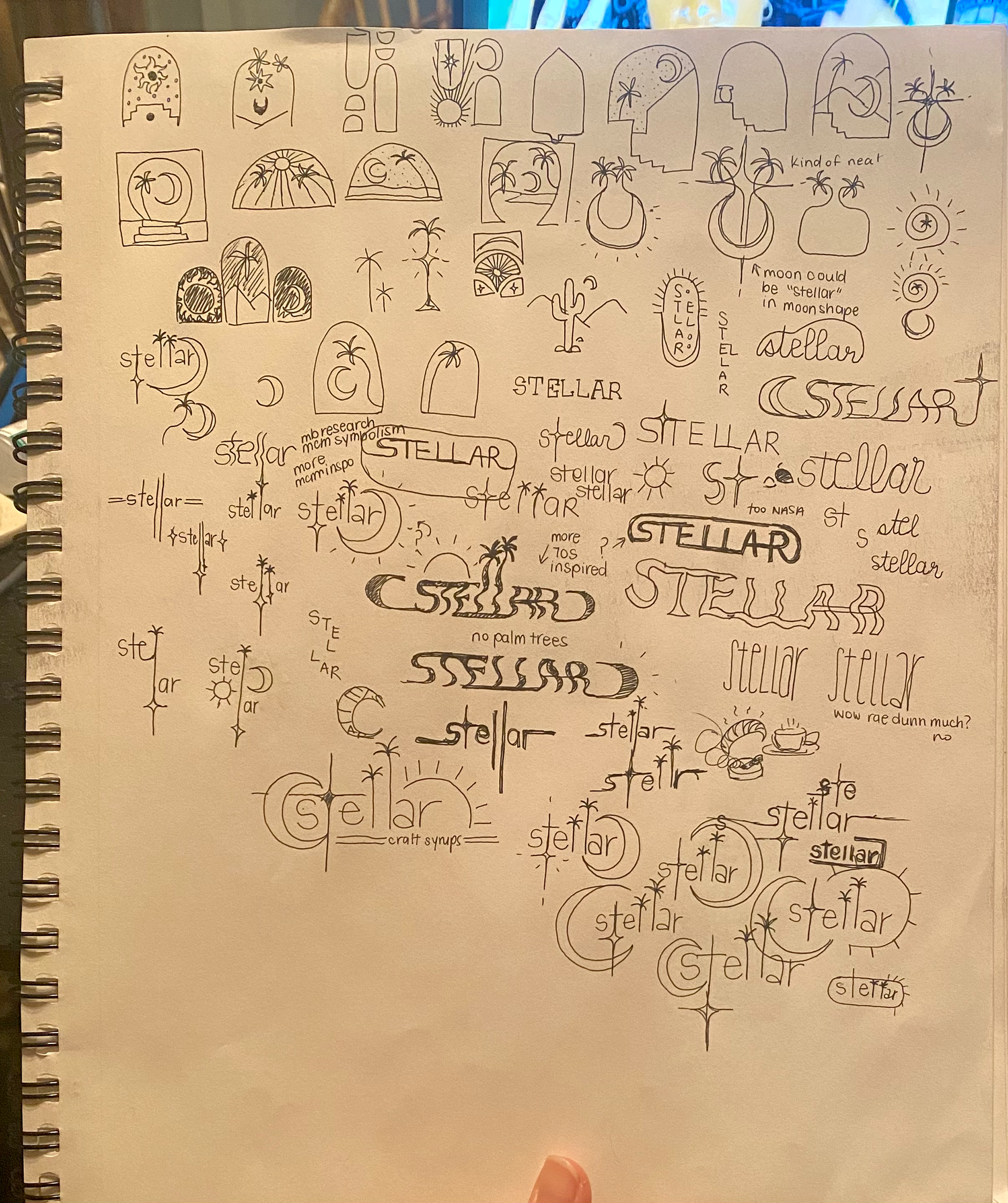
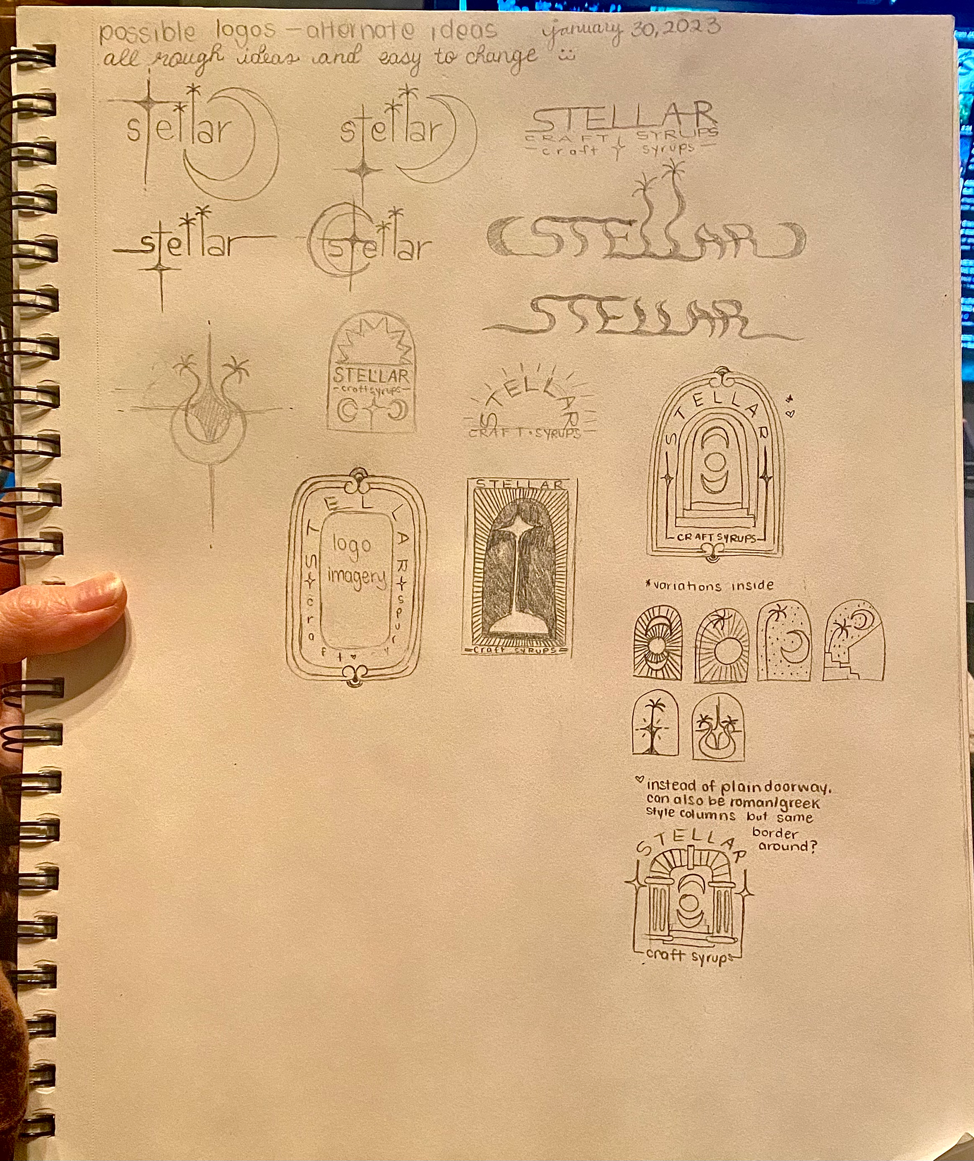
The process of creating Stellar's brand identity was a really fun experience for me. I delved into my saved inspirations, drawing anything that caught my eye and riffing off of those initial ideas. Through trial and error, I narrowed down the logo to a trendy arch-style with Roman columns and stairs that reminded me of an ancient Armenian temple, paying homage to Anna's cultural heritage.
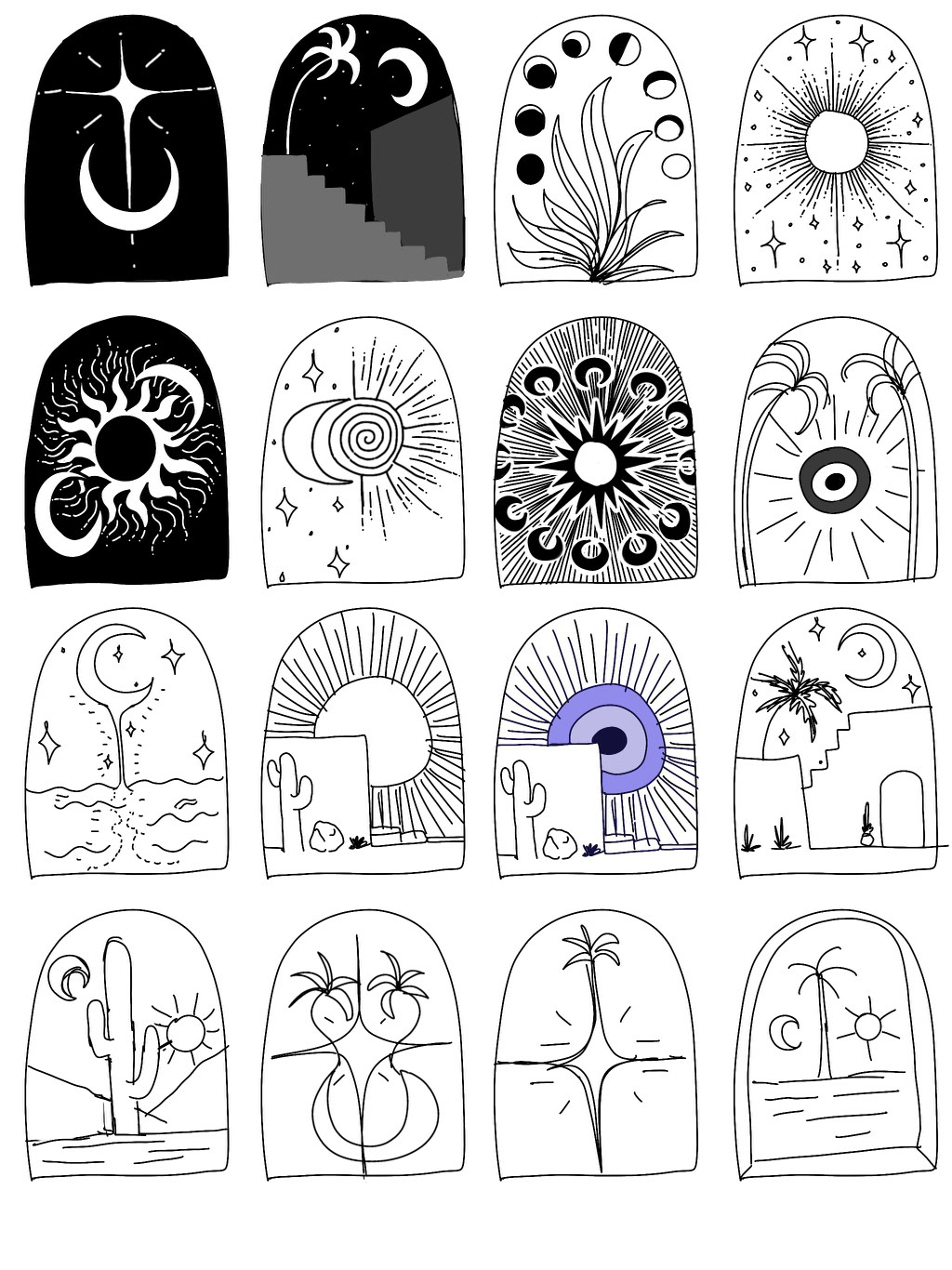
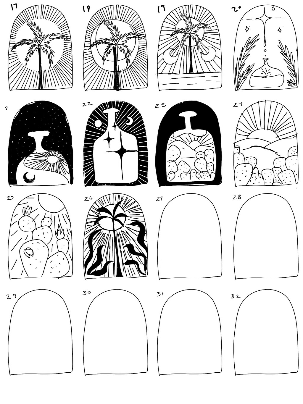
This design features an interior space for artwork, which gives me the freedom to showcase unique art tailored to each individual syrup flavor on the bottles themselves. It also allows for a primary style to be used on business cards and other branding materials. It then came down to finding the interior primary style, of which we explored the following:
As this is first branding project, I learned some crucial lessons that have since guided my approach to design. While I worked on different concepts and ideas, I realized the importance of putting my personal preferences aside and focusing on creating a product that the client would be happy with. However, I also discovered that it's equally crucial to keep in mind my own happiness and creative fulfillment in the process.
Specifically, I learned not to present any designs that I would be unhappy with if the client chose them. Although it's important to prioritize the client's vision and expectations, it's equally important to ensure that I'm proud of the work I'm presenting and comfortable with the client's potential choices. This helped me maintain my creative integrity while also delivering high-quality work that met the client's needs. We narrowed it down to 5, with an inverted option of choice #2.

Out of the five options I presented to Anna, there was one that stood out as particularly impressive to me. As I looked at it, I couldn't help but feel a little anxious, knowing that it had to live up to the brand's name and convey the essence of Stellar. This design had a lot of character and incorporated several nods to the brand's identity.
After some time had passed, Anna got back to me with her feedback, and to my delight, it turned out that her favorite, her fiance's favorite, and my personal favorite were all the same design! It was such a great feeling to know that we were all on the same page and could agree on the best choice for the brand. Below is the final logo after days of going back and forth, tweaking and nitpicking:

To bring Anna's vision to life, I started by drawing the design on paper, which I then scanned and refined using Procreate on my iPad. Anna wanted the branding to have a distinctly organic, hand-drawn feel, which resonated with me since I have a background in traditional mediums.
After perfecting the design, I moved on to vectorizing it in Illustrator. This was a new process for me, but I was excited to learn and expand my skillset. Throughout the process, I made sure to maintain the integrity of the original design and ensure that no information was lost in the conversion.
As a designer, I always strive to learn something new with every project, and the experience of vectorizing this design was no exception. It was rewarding to see the final product come together seamlessly while still maintaining the unique hand-drawn aesthetic that Anna envisioned for Stellar's brand identity.

With the main aesthetic and logo finalized, the next step in the design process was selecting the color palette and typography. Collaboration remained a top priority as I worked closely with Anna to bring her vision for Stellar's brand identity to life.
Inspired by the celestial theme, I drew from the stars and cosmos to create an initial color palette. However, I realized that it was too dark and moody for Anna's target audience, who were millennials and Gen Z consumers, mostly female and very trend forward.
To cater to this audience, I decided to pivot and take into consideration Anna's personal style and preferences. I created a feminine and elevated color palette, with a nod to 70's-inspired California cool. The addition of cool pink, mustard, and salmon hues complemented the blue tones and added a touch of summer to the overall look.
By being flexible and open to feedback, I was able to create a color palette that truly captured the essence of Stellar and appealed to Anna's target audience.
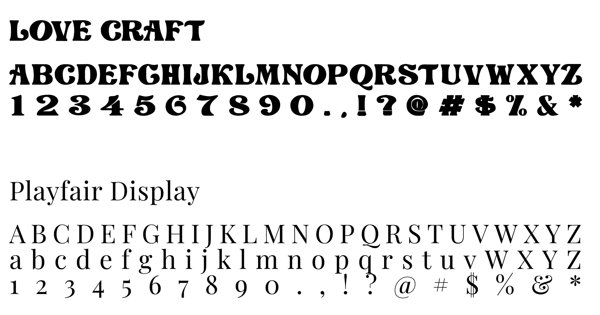
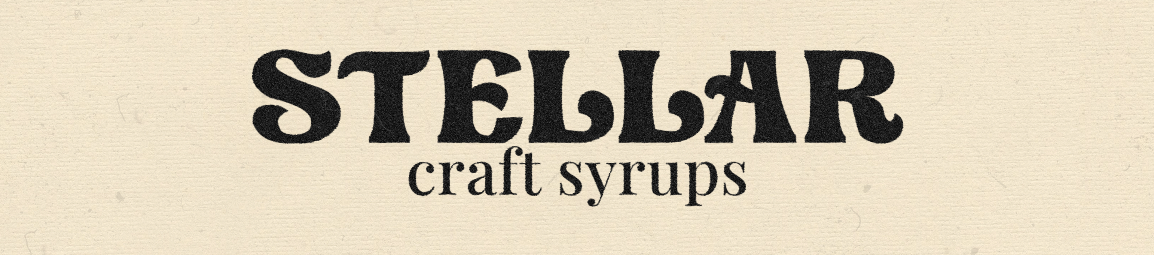
When it came to selecting typography for Stellar's brand identity, I knew that the display font had to complement the logo while also conveying a sense of fun and 70's-inspired grooviness. After exploring several options, I settled on "Lovecraft", a playful font with wide bases and psychedelic ligatures that perfectly captured the desired aesthetic.
To balance out the intensity of the display font, I opted for "Playfair Display" for the copy. This luxurious font added a touch of sophistication and versatility to the overall design, making it suitable for a wide range of branding applications. By carefully considering each font choice and how they worked together, I was able to create a cohesive and effective typography system for Stellar's brand identity.
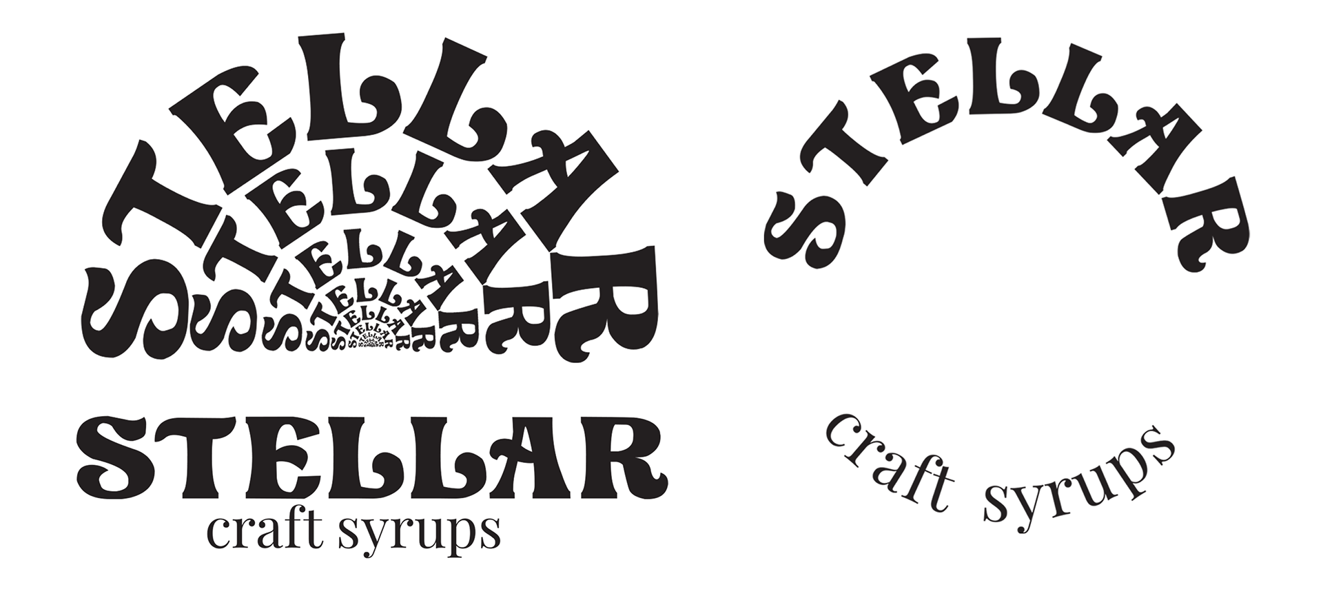
In addition, I have designed a few alternate logo choices to use when the primary logo may be too overwhelming. The first option offers a nod to the 1970s aesthetic, featuring the brand name as an everlasting sun, symbolizing hope and a bright future. The second option is a circular logo with empty space inside, perfect for being used as a brand sticker on packaging. Additionally, the inside of the circle can be filled with a drawing of the syrup flavor (e.g., lavender, hazelnut, rose, etc) to make it incredibly versatile. Lastly, the third option simply features the brand name in its specific fonts for a simplistic approach.
As a special bonus for selecting me to create her brand identity, despite my limited experience, I provided her with a set of hand-drawn elements that she can incorporate into her graphics until she is ready to hire me for additional social media and graphic design work. The plan is to regroup in a few months and develop a more comprehensive brand identity package, which will include a refined packaging design, social media assets, and product photography.
It was such a blast putting together the brand identity for Stellar - Craft Syrups. This was my first time creating a brand identity for a client, and I loved working on an aesthetic that I genuinely enjoyed, but might not have explored on my own. I'm always eager to experiment with new design styles, and for this project, I wanted to try out the luxe boho doodle aesthetic. I'm happy I was able to incorporate it in a subtle and sophisticated way.